A full redesign of the Maxson website with an emphasis on mobile structure and flow for the large percentage of users viewing from worksites.
556
The redesign for the Maxson Associates website started with and heavily focused on the mobile experience. Based on user feedback their existing site was difficult to use when viewed from something other than a desktop; which accounted for a high percentage of traffic from clients on worksites.

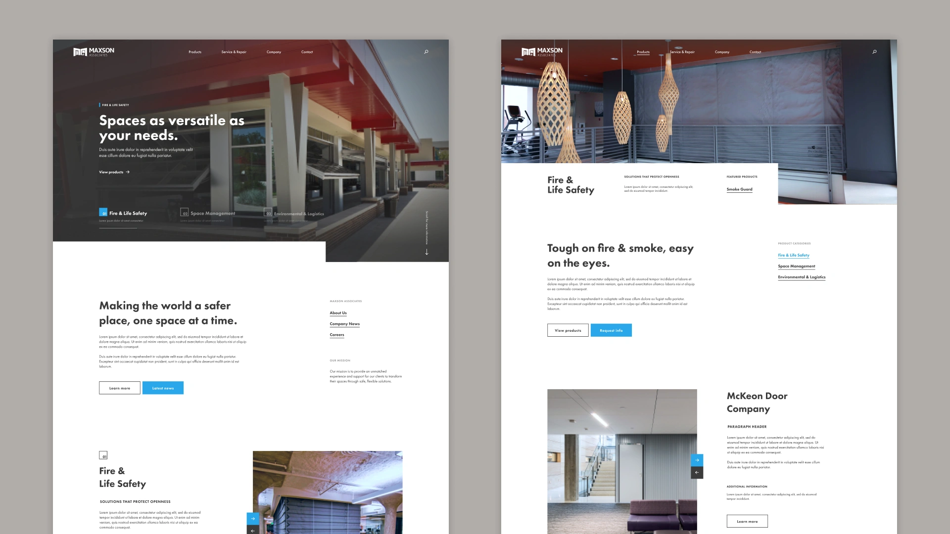
Final home and product page designs. Additional space on desktop allowed for displaying context to sections and image elements; such as the products displayed within a page header and links to read more information about them.

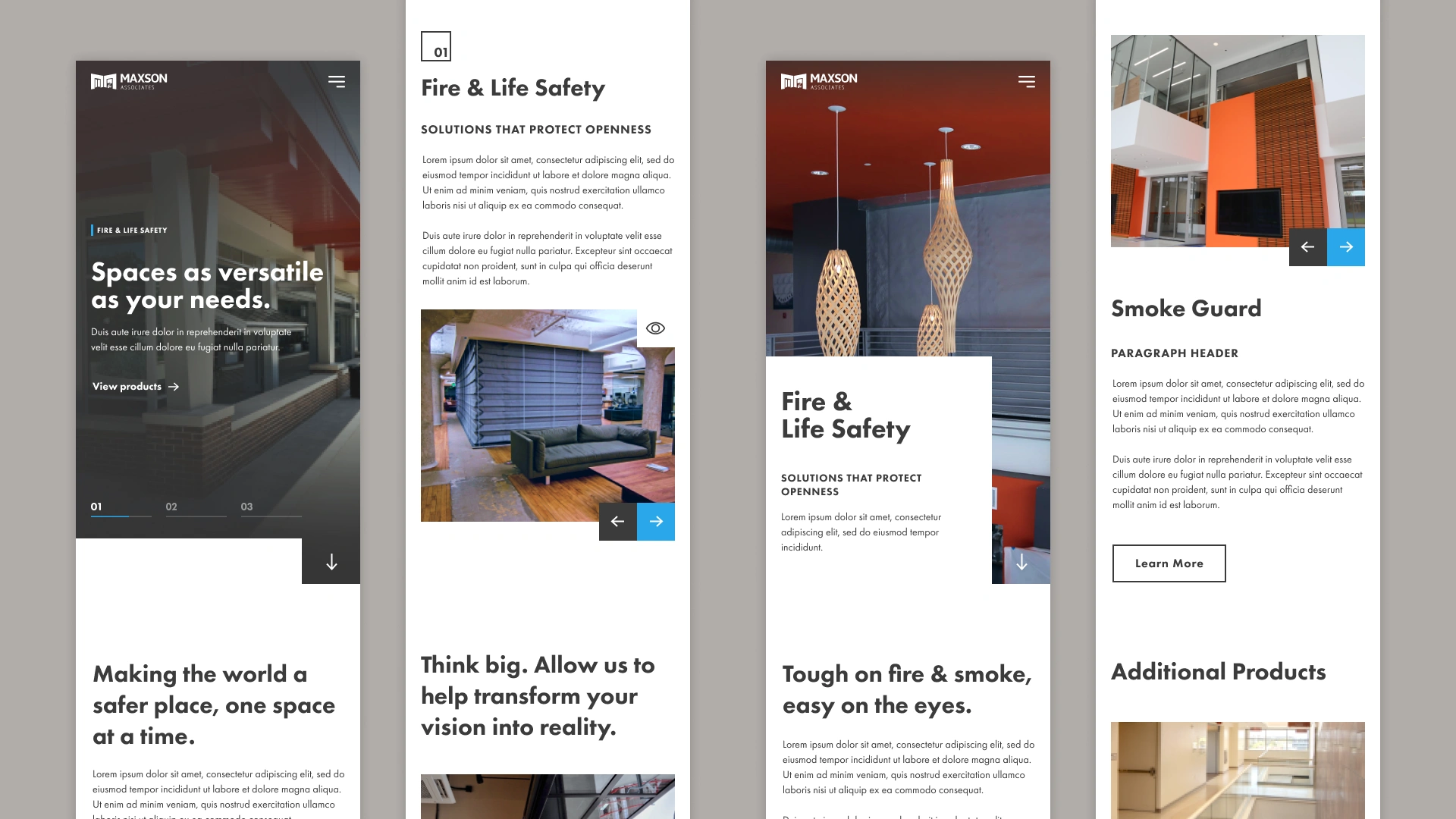
Mobile versions of the home and product pages. With the mobile view taking priority we could ensure that text blocks were not overwhelming and the amount of scrolling required to fully view a page could be kept to a minimum.

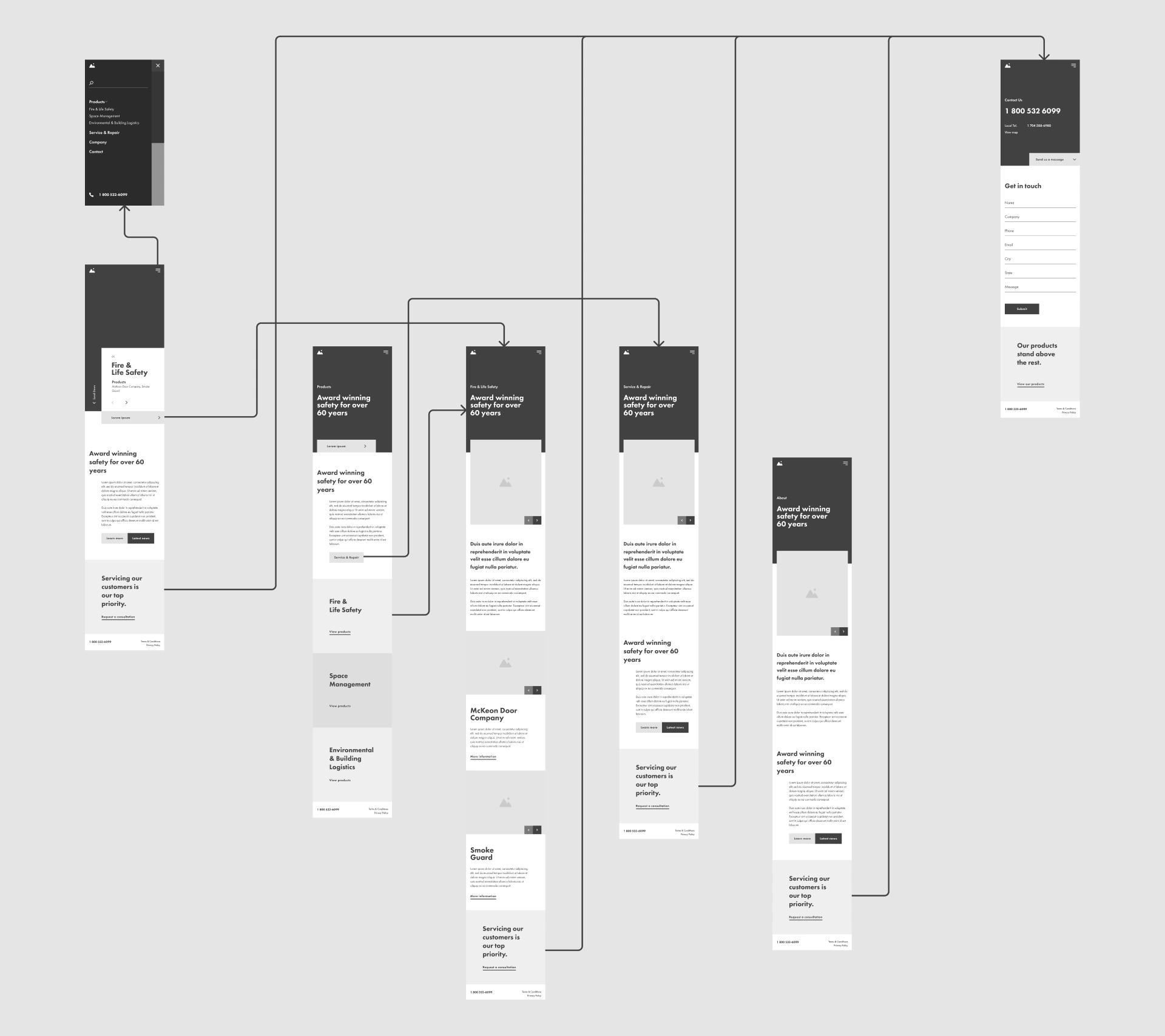
Wireframe prototype designed to establish flow and direct users towards contacting with questions or for a quote.

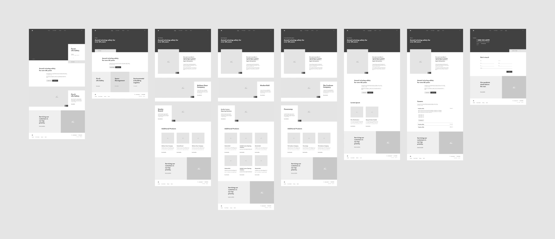
Desktop wireframes created to determine content and placement of elements when more space was available.
Animation demonstrating how elements such as the hero and navigation would react as a user scrolls through the home page.
Repetative info blocks of content supported sliders to help keep large verbose areas of text to a minimum.
Example of how a hover state could be applied to contact links.