A full redesign of E4E Relief's website utilizing their existing branding with the goal to improve user flow and and modernize look and feel.
120
E4E Relief required a new design to help alleviate their pain points with their existing website and provide an experience that better aligned with their vision. Their branding was stripped down to its core colors and new fonts were introduced to keep the design bright, cheerful, and supportive.
The final design won dotComm Awards Gold for Website Redesign.
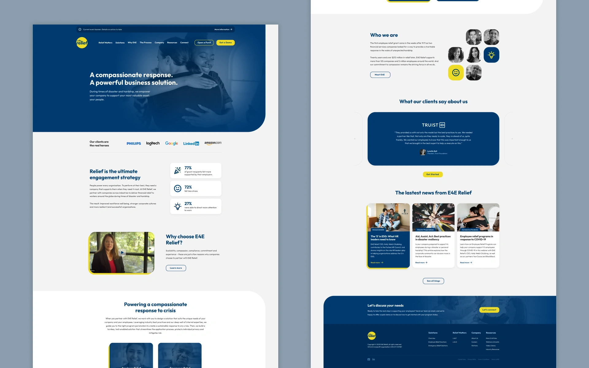
Designs feature two of E4E's primary colors (yellow/blue) with washed out versions of supporting brand colors. Home page design was shortened from wireframe concepts to help minimize scrolling.
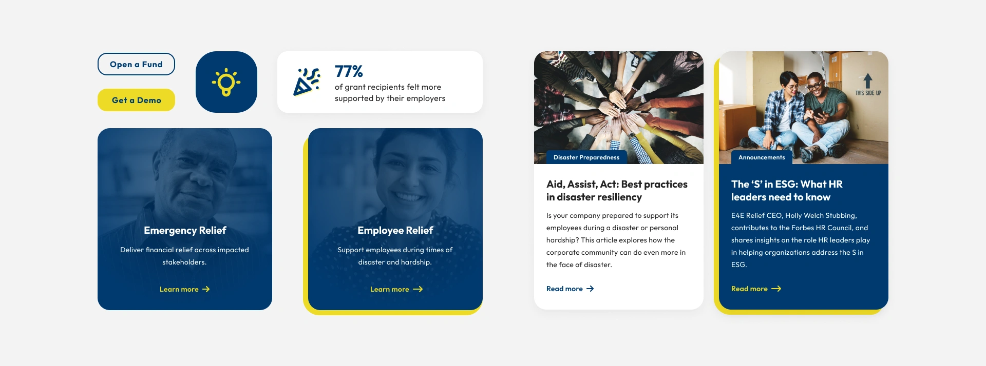
Rounded corners can be seen prominently on nearly all elements. A yellow dropshadow was utilized on most hovers for components other than buttons.
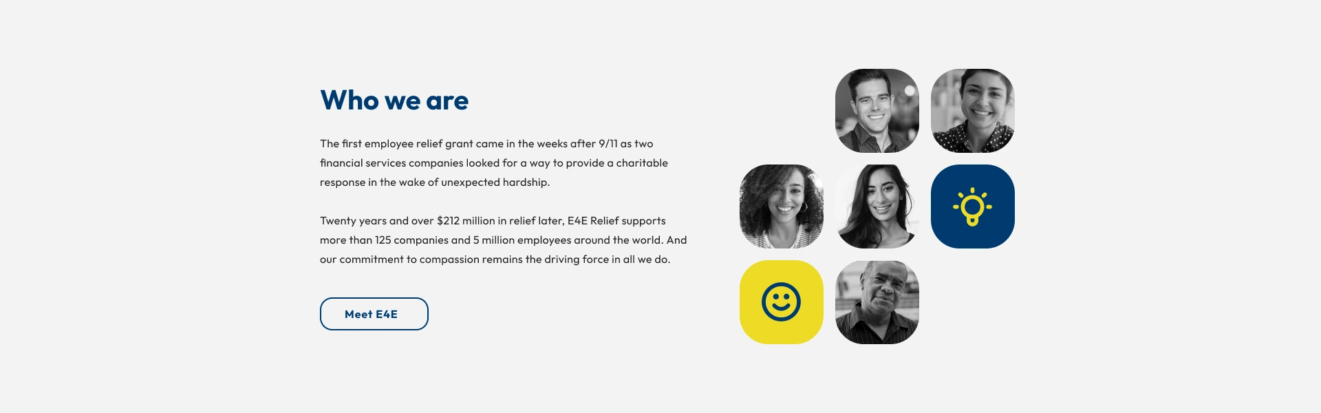
E4E was open to branch out from their brand fonts and use Outfit for headings and paragraph copy.