Branding and 2D art assets created for Hide or Die; a fast paced asymmetrical multiplayer horror game with a focus on mobility, verticality, and hiding.
754
VecFour Digital
UI
Design
Illustrator
Photoshop
2017 — 2018
VecFour Digital required branding and UI designs for their crowdfunded asymmetrical multiplayer horror game Hide or Die.
Early branding utilized a dark logo on a light background to help the game stand out from other horror games on the Steam store.
Final logo designed using a custom font based on Press Feeling Eroded.
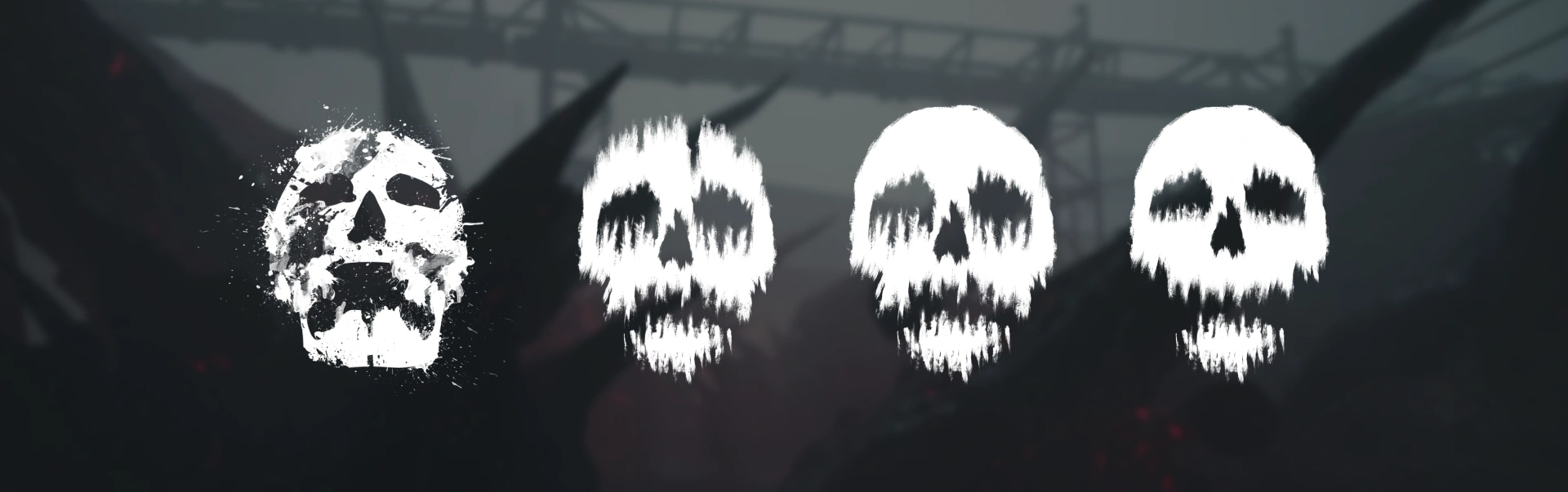
Progression of the skull icon design used for branding and in-game.
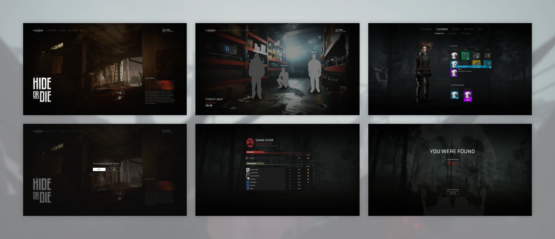
Various in-game and menu interfaces. Some of these were simply explorations to help establish the styling for future UI.
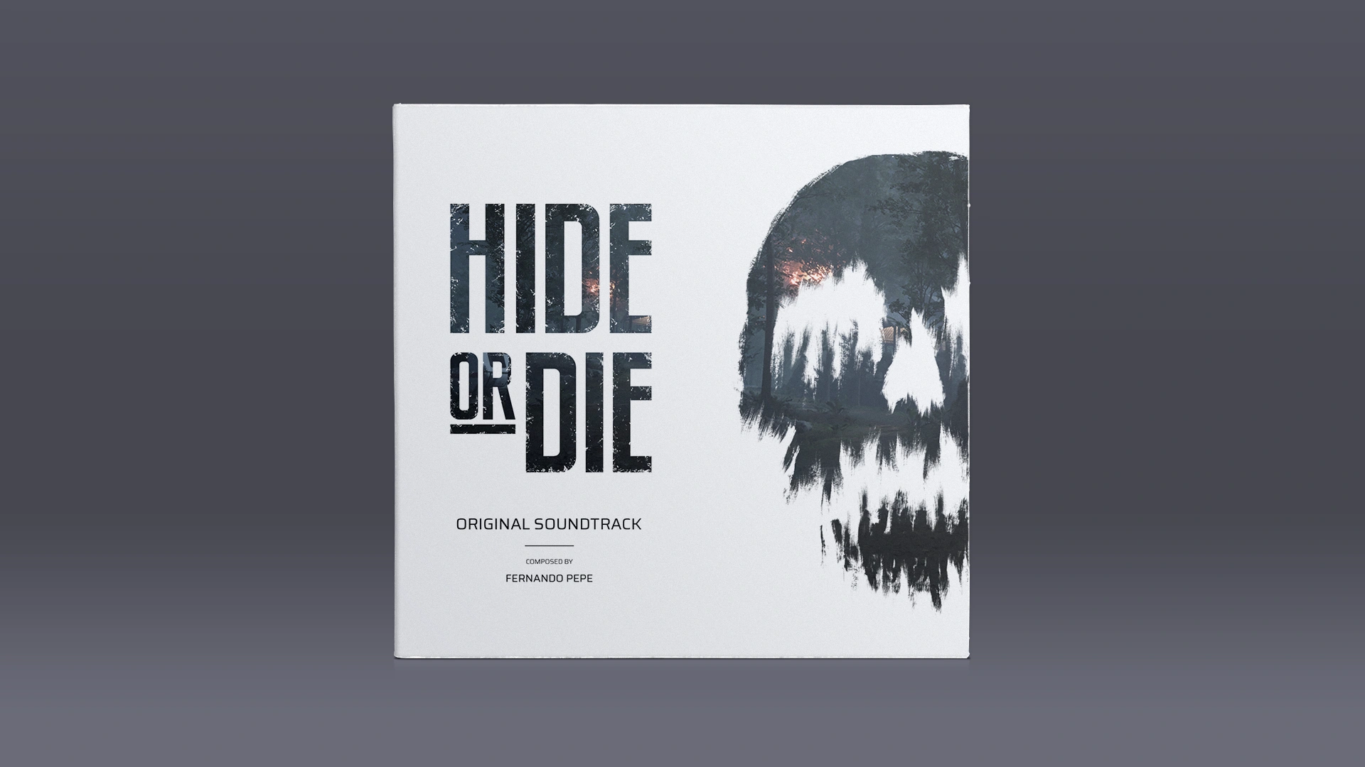
Soundtrack cover art created for use on YouTube and music streaming services.
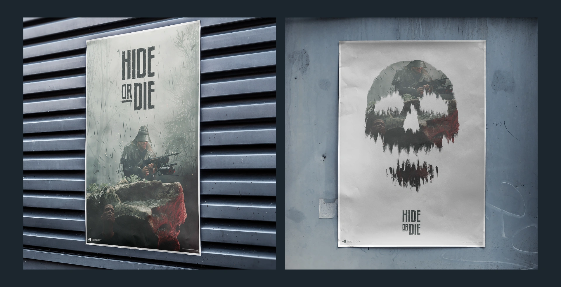
Posters designed for promotional events featuring the game's keyart.